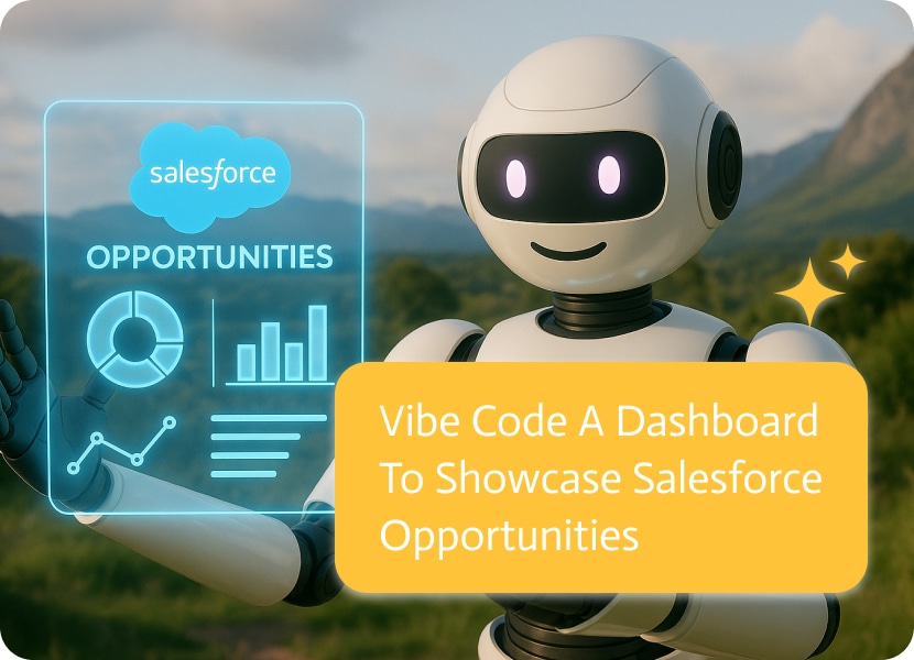

Vibe Code a Dashboard to Showcase Salesforce Opportunities
Imagine simply asking for a dashboard that displays key late-stage opportunities, prioritizes them by likelihood, flags neglected deals, and shows rep performance, and then receiving a ready-to-use application connected to your Salesforce.
That’s the idea behind vibe coding, as Noca applies it: using simple requests to turn your intentions into practical, integrated dashboards that are fast, focused, and built for the people who actually use it. An AI bot can assist in this process by interpreting your requests, suggesting relevant data connections, and helping automate parts of the workflow. Essentially, vibe coding is a way to express what you want in plain English and have the platform produce the app scaffolding, UI, and data connections for you.
Below I’ll walk through why this feat is powerful for opportunity management in Salesforce, what a typical vibe-coding workflow looks like, and how to get the best results when you want a dashboard that actually changes behavior, not just looks pretty.
Why A Vibe-coded Dashboard Matters For Salesforce Opportunities
Sales teams live or die by signals: deal size, stage, age, activity, owner, and forecast category. Traditional BI or dashboard projects often slip into a long loop of requirements, wireframes, and back-and-forth with engineers, this leads to a product that’s either too basic or too slow to adapt when the sales strategy changes.
Vibe Coding Changes This In Three Specific Ways:
Speed from idea to prototype: Rather than spec’ing fields, objects, API mappings, or visuals to an engineering team, you describe the outcomes, and Noca builds the app pieces and integration links. The emphasis is on converting plain-English prompts into functional apps and prototypes in minutes to hours, dramatically shortening the feedback loop.
Better alignment: Because you express your logic directly (“show at-risk deals with zero activity in the last week”), the generated dashboard shows the language and priorities of the sales team, not a technical translation. That not only increases adoption, but also reduces any reworking.
Seamless Salesforce connectivity: Noca provides tools and connectors that enable you to integrate Salesforce, enabling the dashboard to read (and in many cases write) opportunity fields, owner assignments, and related records. That means the dashboard isn’t a static snapshot, it becomes an action layer on top of your CRM.
These differences result in a dashboard that’s current, tailored, and tightly coupled to the workflow that drives revenue.
The four phases of Prompt to flow: contextualize → prompt → iterate → integrate
A practical vibe-coding session with Noca usually breaks into four phases. Each phase clarifies the requirements and builds toward a deployable dashboard.
Contextualize Your Salesforce Opportunity Dashboard
Begin with telling the platform about your sales process, KPIs, and limitations, just a short sentence or a few bullet sentences will suffice: “We have a complex zone-based coverage model; deals over $100k need two approvals; closed-lost reasons must be captured.” Context lets the system pick the correct Salesforce objects, filters, and linking logic to produce meaningful results.
Accurate context prevents the AI assuming standard field names or making aggregation mistakes, and a small upfront investment saves hours later. Noca’s documentation encourages feeding business limitations in the prompt so the app aligns with your workflows.
Create Salesforce Opportunity Dashboards with Vibe Coding
This is the creative bit. Use plain English to describe the screens, interactions, and who will use them. For example:
- “Create a single-page dashboard for sales managers that displays pipeline by stage, weighted forecast total, top 10 deals by ARR, and a ‘stale deals’ heatmap showing time since last activity.”
- “Add an action to mark an opportunity ‘engage,’ which creates a task and pings the owner if the deal hasn’t been updated in three days.”
Good prompts are outcome-focused (what you want to see or do), not implementation-focused (don’t tell it to UI libraries or Apex classes unless you must). Noca’s vibe-coding experience is designed around that style: say what you want and let the generator fill in the how.
Iterating Salesforce Opportunity Dashboards
The first result is never really the right one and that’s by design. Vibe coding is optimized for fast iteration: change a filter, tweak a color, add a drilldown, or change business logic (“exclude renewals under $1k”). Each tweak is applied instantly, producing a new preview. This loop is vastly faster than traditional sprints, where a designer hands specs to engineers and waits.
Bring sample records or a sandbox connection early. When the platform sees real field values, it better understands which fields are numeric, picklists, or relationships, and generates more precise visualizations.
Integrate Salesforce Opportunity Dashboards with CRM
When the layout and logic are right, the final step is integration. Noca supports Salesforce connectors so your dashboard reads from your org and can, where appropriate, push updates (e.g., changing owner or creating tasks). A direct integration makes the dashboard actionable, managers can spot a risky opportunity and trigger the right play without leaving the app. Noca’s Salesforce integration guide lays out these connection steps and good security practices.
Key Features of Salesforce Opportunity Dashboards
A meaningful pipeline dashboard focuses on signals that lead to intervention and action. Vibe coding helps you customize these views quickly:
- Weighted pipeline and trend: show current weighted forecast and 30/60/90-day trendlines.
- Deal velocity and age: median days in stage and a list of stalled opportunities.
- Activity health: calls, meetings, and recent touches per opportunity or account.
- Conversion funnels by rep or segment: Where are deals dropping off?
- Risk flags and play triggers: automated flags for missing approvals, stale opportunities, or conflicting ownership.
- What-if scenarios: filters that let managers model “close rates improve by 10%” to see revenue impact.
Because vibe coding produces custom pieces, you’re able to add bespoke visualizations that standard dashboards don’t offer. For example, a “churn-risk overlay” that cross-references opportunity owner tenure with account health signals.
How Teams Will Benefit
Faster decisions. By collapsing the time between idea and deploy, managers get tools to employ their latest strategy, e.g., a new compensation plan or a focused push on a product line, without long BI cycles. Evidence from Noca’s materials highlights dramatically shorter prototyping times.
Higher adoption. Dashboards that speak the sales team’s language and provide one-click actions see more use than static reports in shared folders.
Lower engineering cost. Routine dashboard tasks that originally required a developer can be handled by product or ops teams using vibe prompts, freeing senior engineers for platform-level work.
Safer experimentation. Because iteration is cheap, you can A/B dashboard variants to see which layouts or alerts change behavior without committing months of dev time.
Closer to the source of truth. A direct Salesforce integration avoids stale ETL pipelines, and the dashboard reads the canonical opportunity data, which in turn reduces the mismatch between reports and reality.
Common Problems and How to Avoid Them
Vibe coding isn’t perfect just yet, here are frequent issues and how to avoid them:
- Vague prompts produce vague dashboards. Be specific about the audience, what data to show and limitations. Use example records if possible.
- Security and governance. Any integration with Salesforce must follow least-privilege access, and sandbox testing. Treat generated apps like production software: review access scopes and logs.
- Complex business logic oversight. For highly complex triggers or transaction-heavy automations, pair vibe-coded components with an engineer to ensure performance and compliance.
- Over-reliance on defaults. The generator will choose reasonable defaults; review calculated fields to make certain they do actually match company definitions.
How To Write Good Prompts For Opportunity Dashboards
A short checklist for high-quality prompts:
- Start with the audience (“for Sales Managers / SDRs / Revenue Ops”).
- State the purpose (“spot stalled deals and assign playbooks”).
- List must-have metrics and actions (weighted forecast, stale-deal flag, and create a task button”).
- Provide thresholds and examples (“stale” = no activity in 7 days; “large deals” = > $50,000).
- Mention integration needs (“read/write to Opportunity object; sandbox first”).
A well-crafted prompt shortens the iterate phase and yields a dashboard your team will actually use.
Real Examples And Proof Points
People are already using vibe coding to build Salesforce-facing apps and portals, including demos that show creating and updating Salesforce records with a single instruction and building customer portals that handle parent-child relationships. These practical demos demonstrate that vibe coding is not just for read-only dashboards but also for bidirectional workflows and embedded interactions.
When to Use Vibe Coding for Salesforce Dashboards
If you need a dashboard quickly, want to match your sales intent and UI, and value frequent iteration, vibe coding is a sensible first stop. Use it for pilot dashboards, manager-facing tools, and playbook rollouts where the cost of delay is high. For complex, regulated, or large pipelines, combine these apps with developer assistance.
At its best, vibe coding with Noca turns the painful “do we mean the same thing?” conversation into a shared, working artifact. You don’t lose rigor — it adds speed and clarity, not to mention a connection between the people who sell and the tools that guide them. If your goal is clearer pipeline visibility and faster action on opportunities, it’s worth trying a prompt to app approach: describe what you need, watch a usable dashboard appear, and iterate until it’s exactly what your team needs

Texting a company at midnight and getting a reply in seconds, or ordering your Tuesday latte from an inviting app that remembers your previous orders,…
Deleting a product issue in monday.com is a quiet action with loud consequences. It can be legitimate cleanup, a duplicate being removed, or a mistaken…

Using AI for brainstorming isn’t just a trend, it’s changing how we think of new ideas, solve tough problems, and get past those creative blocks….