
How to vibe-code a custom AI analytics dashboard for Priority
Custom AI Analytics Dashboard empowers managers, analysts, and ops teams to get the reports they actually need, without relying on IT. If your organization runs on Priority ERP but your dashboards feel like they were designed by committee and shipped in 2012, this is for you. “Vibe-code” is the modern shorthand for using natural-language-driven, AI-first no-/low-code tools to describe an app and have the platform generate the plumbing, queries, and UI — essentially a prompt-to-app approach. When you combine that with Priority’s open API surface and a thoughtful approach to data modeling, you can give business users direct control of custom analytics fast, safely, and repeatably. Priority already offers self-service analytics, but sometimes you need something very specific, very timely, or cross-module in a way standard BI doesn’t easily deliver. Vibe-code forms the bridges to cross this gap.
Here’s a step-by-step guide to go from concept to live dashboard, aimed at non-developers who want outputs that don’t suck.
1) Start with the question for your custom AI analytics dashboard
Every good analytics app begins with a decision to be made. Resist the temptation to open a charting tool first and simply ask:
- Who will act on this dashboard? (Project manager, purchasing, warehouse leads?)
- What is the one decision they need to make from it? (Approve orders, reallocate stock, escalate late projects?)
- How often must it update? (Real-time, hourly, daily?)
- Document KPIs and the data fields required (e.g., order date, lead time, supplier, backlog quantity). This makes the rest simple.
When you’re vibe coding, you’ll prompt the platform in English, but remember, the clearer the intent, the better the generated UI will be.
2) Verify ERP data for your custom AI analytics dashboard
Priority exposes a REST/OData API that lets external tools query ERP data. Confirm any endpoints that hold the data you need (sales, inventory, projects, time logs). Also confirm you can create a read-only API key scoped only to the required modules, because minimizing access reduces risk.
Ask your ERP admin to provision an integration user that’s strictly scoped for analytics. It avoids the classic “I gave the dashboard full DB access” headache.
3) Choose Noca as Your vibe-coding platform
Not all natural-language builders are equal. Some convert text to UI + backend (true vibe coding), others only scaffold frontend visuals. Noca provides a platform that can:
- Orchestrate data transformations (joins, aggregations, windowing).
- Provide a dashboard composer with widgets, filters, and scheduled refreshes.
- Noca is an example of an AI-first no-code platform that supports natural-language app generation and can orchestrate integrations for ERPs like Priority; it’s designed for enterprise workflows and agent orchestration.
4) Write the perfect prompt to generate Priority dashboards
This is the core of vibe coding: plain English that maps to the analytical product. Here’s a repeatable prompt template you can use and adapt:
“Create a read-only analytics dashboard called ‘Production Bottleneck Monitor’ for ops managers. Pull production order data, work center cycle intervals, and stock on hand from Priority. Show: (1) Rolling 30-day throughput vs target, (2) Top 10 slowest work centers with average cycle time, (3) Items with a minus available quantity, and (4) A table of at-risk orders (expected completion > target by >24 hours). Add filters for specific date range, plant, and product family. Refresh hourly. Use a green/yellow/red status for KPIs and allow CSV export. Use the Priority REST API to access [list endpoints or tell the tool to discover them].”
- Be explicit about refresh cadence, filters, export options and users.
- If the platform can inspect Priority metadata, let it (or paste sample field names). That does wonders in saving the back-and-forth.
5) Verifying the data model for accuracy
When the tool generates queries/joins, review the proposed model. Ask the platform to show the SQL or OData queries it will run. Validate key points:
- Are joins using stable keys (document/item IDs) and not text fields that can drift?
- Are date/time zones handled correctly? (ERP times can be local or UTC.)
- Did it include necessary company-level filters (multi-company setups)?
- If something doesn’t look quite right, edit your prompt and regenerate. This is where a little skepticism pays off.
Citation: Priority’s API docs and developer portal are your friend for confirming field names and example queries.
6) Add lightweight ETL/transformation steps in plain language
Real dashboards often need small transforms: rolling averages, percent to goal, or mapping supplier codes to friendly names. Ask the vibe-coder to:
- Create a calculated column days_delay = expected_completion – planned_completion.
- Build a cached view for “daily order snapshot” refreshed hourly so the dashboard runs quickly.
- Add deduplication rules if the Priority feed contains historical revisions.
When a platform applies vector or LLM features, avoid putting sensitive or PII into plugins and keep transformations server-side.
7) Design the UX by describing behavior, not pixels
You don’t need to be a UI designer. Describe interactions:
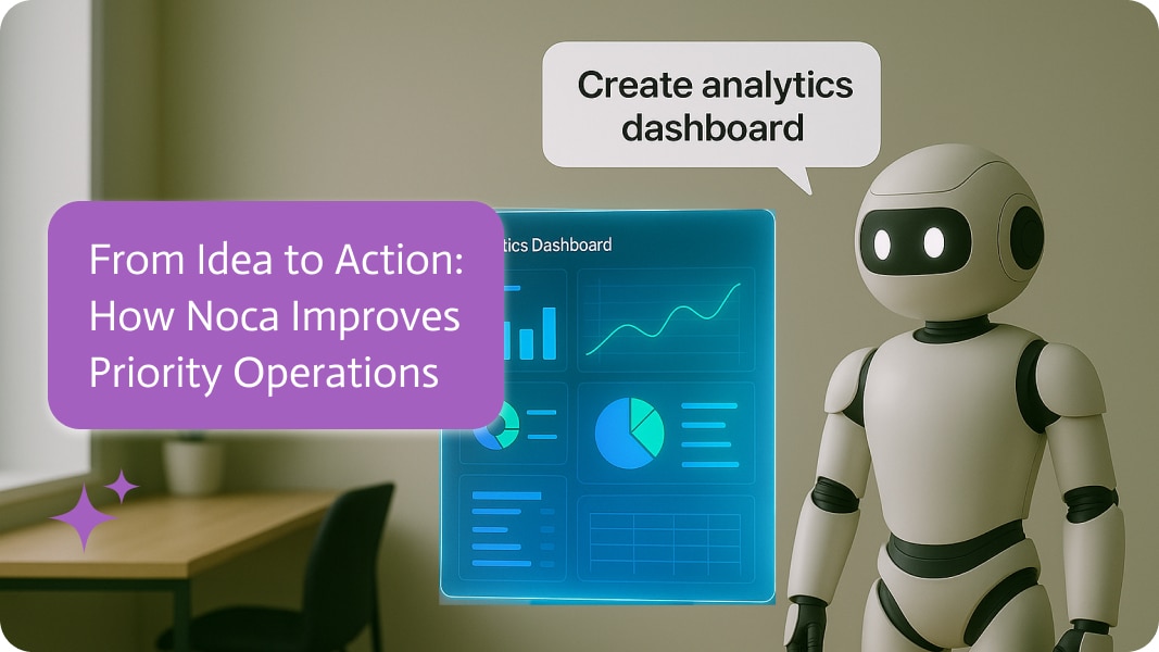
- Top row: KPI tiles for throughput, average cycle time, and on-time percentage, with a small trend graph and the last update time.
- Middle: a bar chart for the 10 slowest work centers with a button to see the related orders.
- Bottom: a table with filters and a ‘send alert’ action.
Vibe coding tools will turn that into a layout and widgets. Test the process. Can managers click from a KPI to the orders that are causing problems and then to the original Priority record? If not, add that requirement to the prompt
8) Add alerts and automations for smart ERP workflows
The win here is not just pretty charts, it’s to make them actionable. Have the platform:
- Send an alert when the on-time percentage is below 85% or when a KPI drops below a certain point.
- Include a “Suggested action” in the alert with a link to the Priority order or a pre-filled email to the manager in charge.
- Add an approval button that starts a simple process back in Priority through the API.
This is how you turn insights into actions rather than having IT do any babysitting.
9) Security, governance and audit trail
You’re putting business decisions on top of financial data, so do this properly:
- Use role-based access: different views for execs vs. shop floor.
- Enforce API user scoping and log all queries.
- Keep an audit trail of dashboard changes and who accepted generated transformations.
- Establish a review cadence where IT or data governance vets any new dashboard that uses more than X fields or is shared outside a team.
Priority supports multi-company and scoped access; pair that with your platform’s auth to keep things tidy.
10) Run a pilot test before scaling your AI dashboard
Run a 2-week pilot with a single team:
- Develop the display using “vibe” prompts.
- Run the team through 2 daily standups where they use it to address real-life scenarios.
- Collect all the feedback: missing metrics, confusing UI, and false positives in alerts.
- Refine and lock the production refresh schedule, and then let different teams play around. This quick cycle of changes is where vibe coding is helpful.
11) Examples of useful dashboards to build first
- Cash flow risk checker: AR aging, largest invoices due, predicted shortfalls next 30 days.
- Purchase order choke points: Supplier lead time variance, overdue deliveries, items frequently out of stock.
- Project health dashboard: Tasks vs baseline, resource burn rate, budgets vs actuals.
- These are high-value because they reduce manual reconciliations and unblock decisions immediately.
12) Why IT matters for your custom AI analytics dashboard
Vibe coding removes speed bumps, but IT still matters for three things:
- Setting up and securing the Priority integration user and network rules.
- Approving dashboards that will write back into Priority or trigger financial actions.
- Ensuring long-term performance of cached datasets.
When business leads the product and IT secures and governs the plumbing, processes are streamlined and everything works the way it should.
Follow the final checklist from prompt to production-ready dashboard
- Defined decision and KPIs.
- Scoped Priority endpoints and API key.
- Chosen vibe-coding platform with Priority connector.
- Clear plain language instructions for dashboard + transforms + cadence.
- Security: role access, API scoping, audit.
- Pilot with users, iterate, then roll out.
Closing note (Vibe Coding and ERP)
Vibe coding is not magic, it’s a turbocharged workflow: human clarity + a platform that translates intent into queries, transforms, and UI. Give it crisp prompts, implement safeguards, and let prompt automation do the heavy lifting, turning simple instructions into functional workflows—so the dashboard works, not just looks pretty. If you follow the steps above, managers and analysts will stop filing tickets with IT and start actually using Priority data to run the business. That’s the point..


